


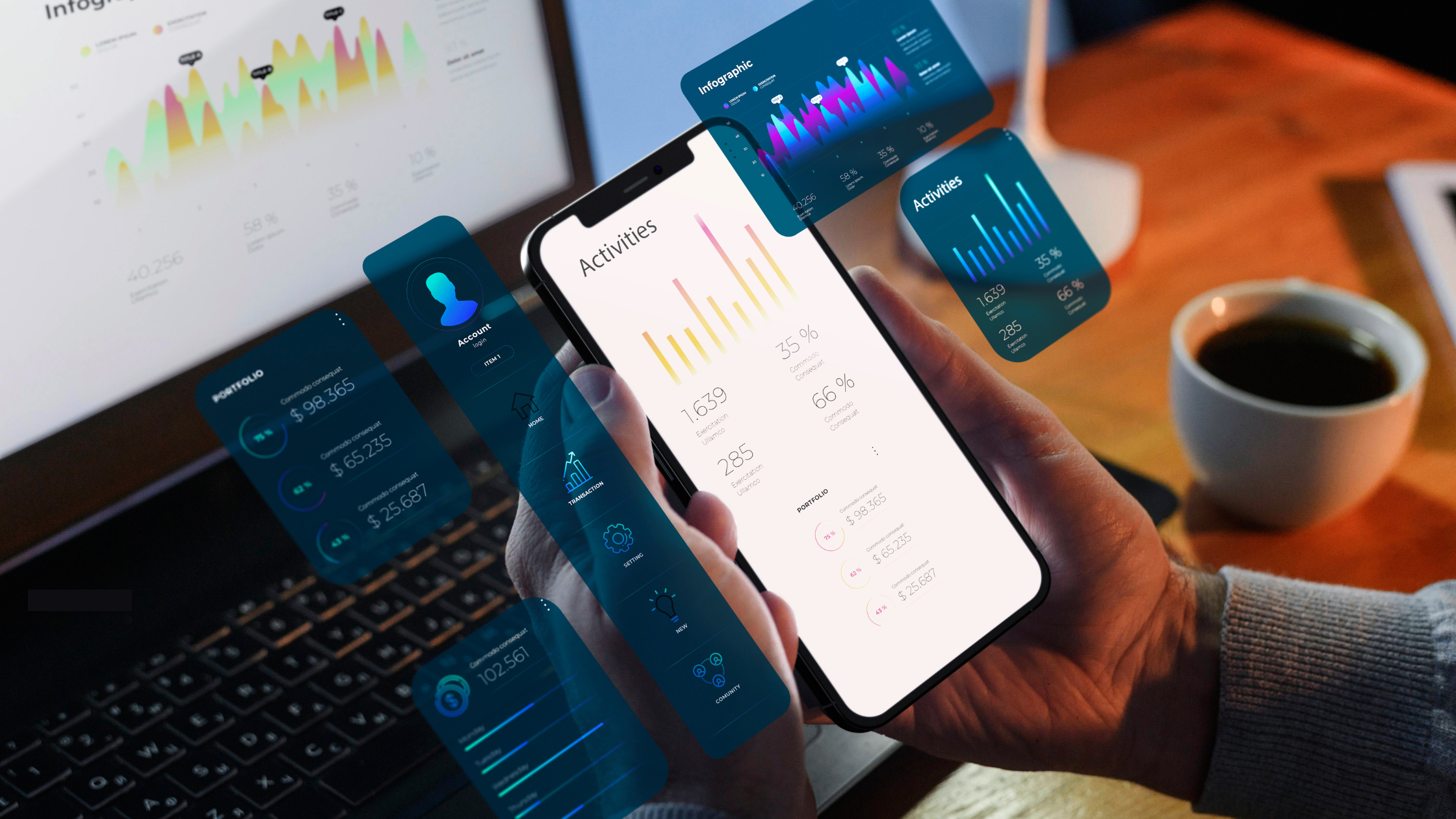
Building an app isn’t just about writing code anymore.
Users today expect more than just a working app; they want speed, simplicity, and purpose in every tap. To meet those expectations, mobile development must go beyond writing code. It’s a strategic blend of design, performance, and problem-solving that delivers real value to both users and businesses.
Whether you’re a startup founder looking to launch your MVP or an established brand scaling your digital presence, understanding what makes a mobile app truly great can set you apart from the rest. Let’s break it down.
1. Great Mobile Development Starts with Strategy
Before a single line of code is written, a great mobile development process begins with asking the right questions:
- Who is the target user?
- What problem is the app solving?
- Which platforms matter most — iOS, Android, or both?
- How will success be measured?
This discovery phase helps shape the product roadmap, define feature priorities, and align the mobile strategy with business goals. Skipping this step often leads to apps that may look good but fail to meet user needs.
Remember: a clear strategy is the foundation of scalable app development.
2. UI/UX Design That Works for the User — Not Just the Brand
Design isn’t only about appearance, it’s about the experience users have when they engage with it.
The best mobile apps don’t just look good they feel right. Every button is right where you expect it, forms are effortless to complete, and navigating the app feels natural. When the user experience is truly seamless, the app becomes almost invisible — letting users focus on what they came for, not how to get there.
Mobile development must always include a strong UI/UX design process, including:
- User research and persona building
- Wireframes and clickable prototypes
- Iterative user testing and feedback loops
Why is this important? Because even the most powerful app will fail if users can’t figure out how to use it within the first few taps.
3. Choosing the Right Tech Stack
Every high-performing app is powered by the right mix of tools and frameworks. Choosing the ideal tech stack is crucial to successful app development and it’s rarely a simple decision.
Options range from:
- Native development (Swift for iOS, Kotlin for Android)
- Cross-platform frameworks (Flutter, React Native)
- Hybrid apps (using web tech within native shells)
Each has its pros and cons. Native development often offers the best performance and access to device features, while cross-platform solutions reduce development time and cost.
What matters is selecting the tech that aligns with your business goals and user expectations, not just what’s trendy.
4. Performance, Speed & Scalability
Let’s be honest if your app isn’t up and running in under 3 seconds, most users are already moving on.
Performance is one of the most underrated aspects of mobile development. Great apps are:
- Fast
- Responsive
- Resource-efficient
- Battery-friendly
- Secure
And most importantly, they’re scalable — meaning they’re built to handle growth in traffic, users, and data without falling apart.
That’s where strong backend architecture, cloud integration, and proper QA testing come into play. A good mobile development team always thinks ahead, building infrastructure that supports scale from day one.
5. Testing Because Bugs Kill User Trust
You might be able to fix bugs after launch, but the first impression is everything.
Quality assurance (QA) is a crucial part of mobile and app development. It includes:
- Functional testing
- Performance testing
- Cross-device compatibility testing
- Security testing
- Usability testing
The goal? Catching bugs before users do. Great mobile development includes automated and manual testing processes that make sure the app performs as expected on every device, every time.
6. Continuous Updates & User Feedback

The launch is not the finish line. It’s just the beginning.
A great app evolves. It learns from how users interact with it. It listens to feedback, fixes issues quickly, and constantly improves.
The best mobile development teams work in agile sprints, releasing new features, improving UI/UX, and addressing user feedback in real-time.
Building a feedback loop directly into the app (like a survey or rating prompt) can help prioritize updates that matter most to your users.
7. Data-Driven Decisions & Analytics
You can’t improve what you don’t measure.
Great mobile apps are powered by smart analytics. By tracking key metrics like:
- User retention
- Session time
- Conversion rate
- Drop-off points
…you can identify what’s working, what’s not, and where to optimize.
Tools like Firebase, Mixpanel, or custom dashboards help make sense of the data and drive future development efforts.
8. Post-Launch Support That Actually Supports
Here’s a truth many businesses learn the hard way: an app without post-launch support is a ticking time bomb.
Great mobile development doesn’t end at delivery. Ongoing support and maintenance are essential for:
- Fixing unexpected bugs
- Ensuring OS compatibility (iOS/Android updates happen frequently)
- Scaling infrastructure
- Rolling out new features
The best partnerships don’t just launch your app — they stay with you to keep it alive and thriving.
Mobile Development Is a Team Sport
Behind every successful mobile app is a cross-functional team: strategists, designers, developers, testers, and marketers all working in sync.
If you want to build an app that actually drives value, you need more than just code. You need a process built on research, strategy, creativity, and care.
At the end of the day, great mobile development is about delivering a product that users love and businesses grow from. It’s not just what’s on the screen it’s what happens behind the code that counts.
✅ Ready to build your next app with a partner who understands the full picture?
Whether you need full-scale app development, UI/UX strategy, or just a roadmap to start, Diginnovators is here to help.


